

One narrow column of equal parts
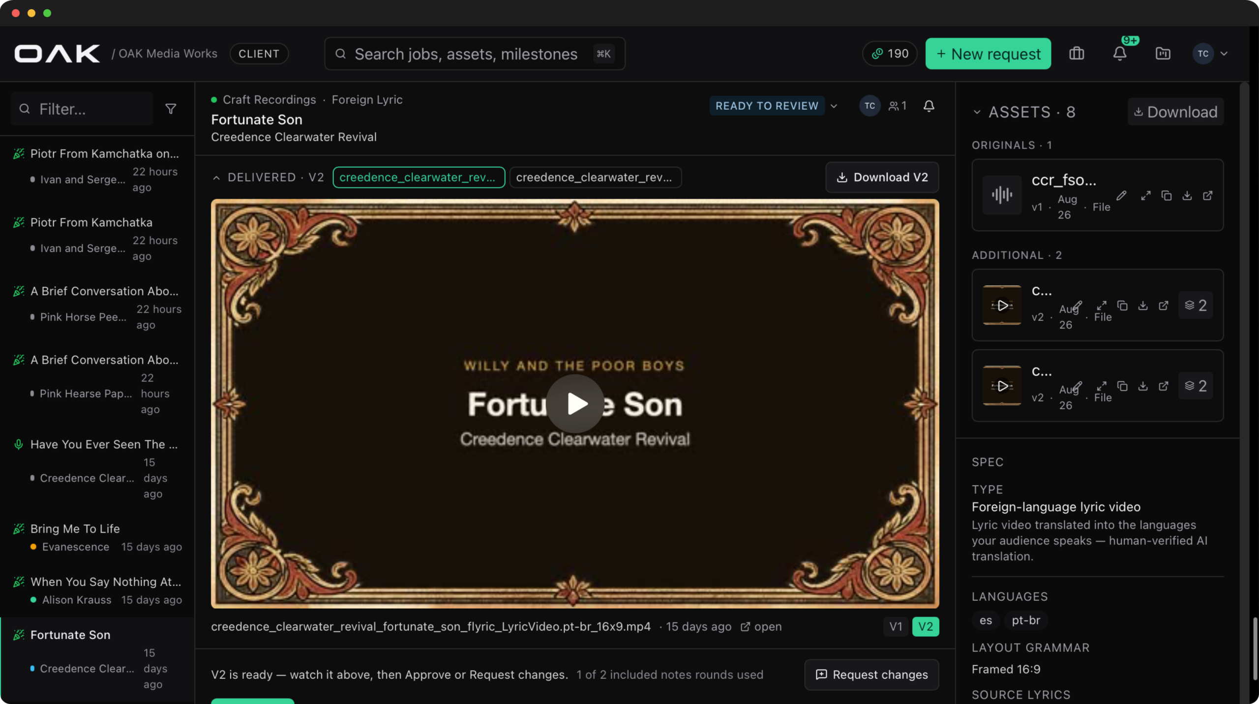
- No due date on screen
- Locks unexplained
- Notes stamped with clock time
A workspace built around the decision
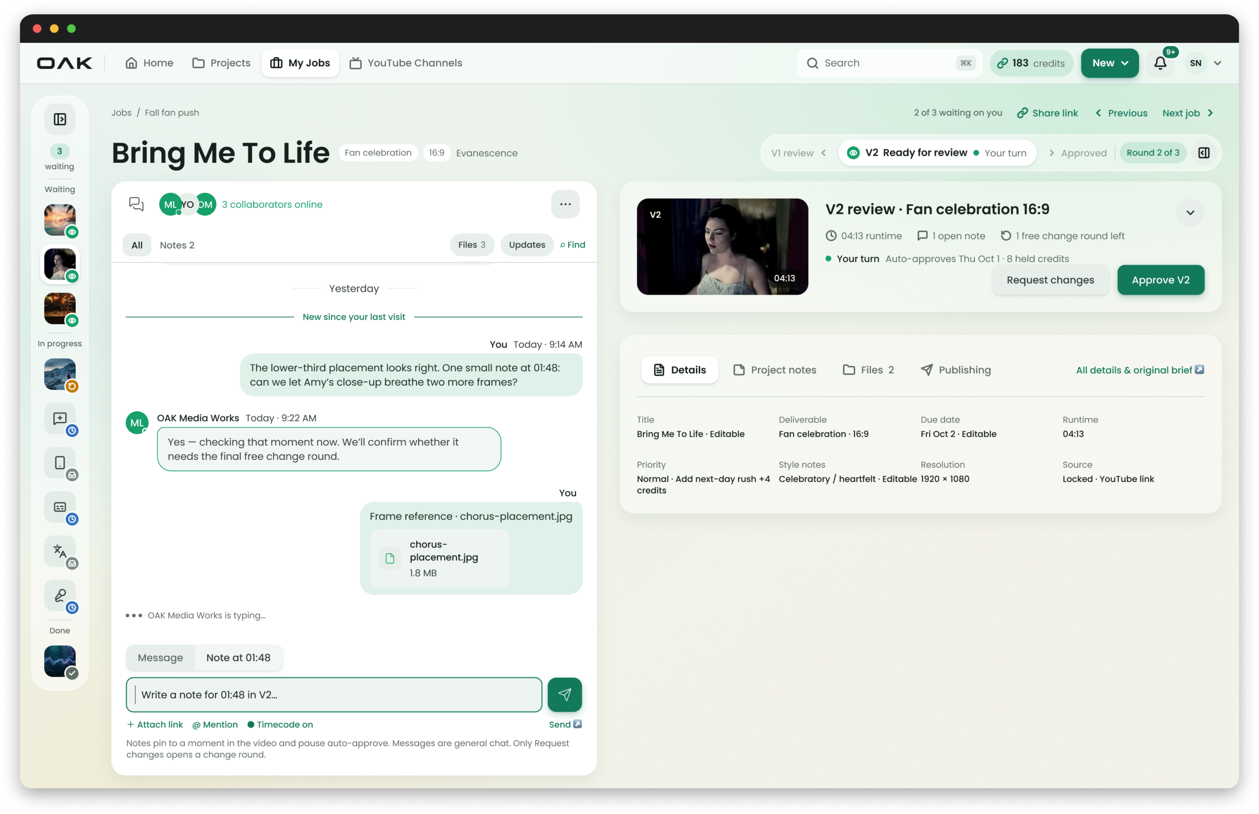
- Whose turn it is, up top
- Notes pinned to the video
- Editable or locked, labeled
Four answers before anyone scrolls
The live page made labels hunt for each of these. Now they sit in the top half of one screen, and the thread stays beside them.
01 · The problem
Labels had to hunt for their own order, and approving looked like every other button.
I found it as the tester.
Before launch I ran OAK's pre-release QA as a client, a label admin and an editor: 18 checks that surfaced 3 blockers and 4 major issues. All four majors landed on one screen, the job page. The title and due date couldn't be found or edited, locked fields looked editable, plain clients could change a job's production status, and revision notes recorded the time of day instead of a moment in the video.
A label ordering anywhere from 2 to 200 videos lives on this page. Every one of those gaps becomes a support message.
02 · Role and constraints
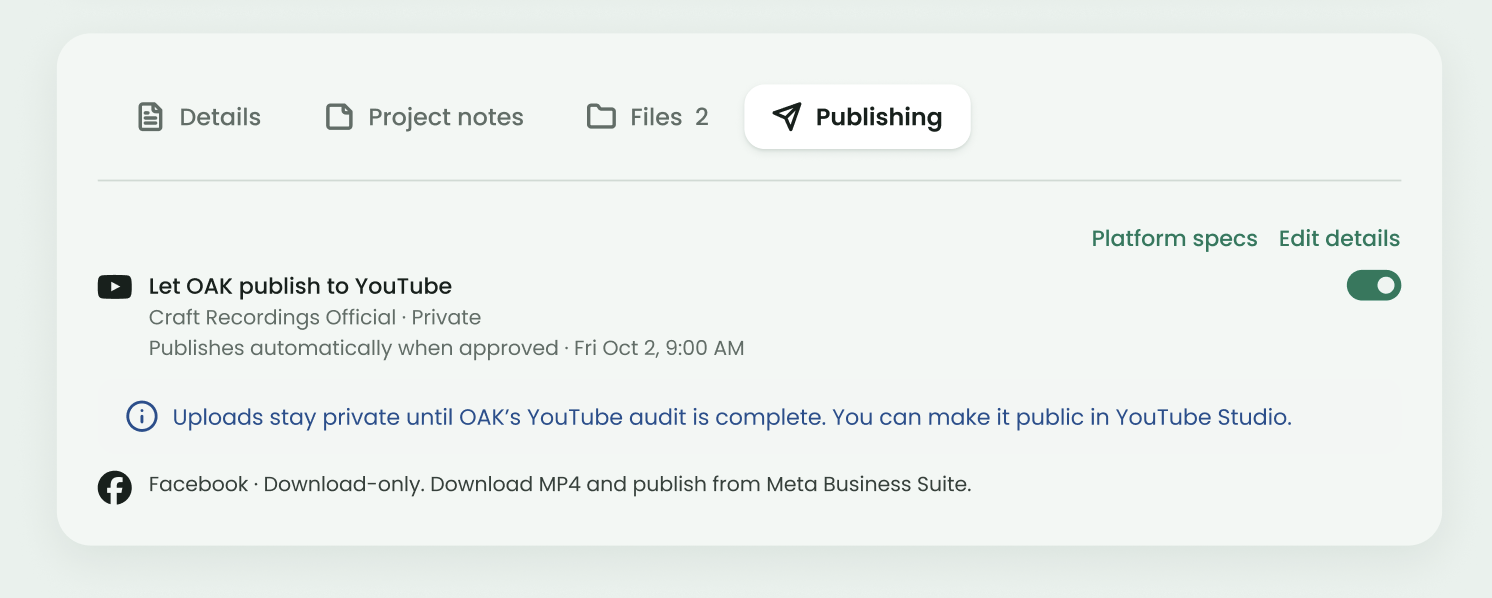
One screen carries the review, the conversation, the money and the publish.
What I owned
QA through the redesign, plus OAKroots, the design system it's built from: the interaction model, components, light and dark themes, and specs written for AI-assisted builds.
Two apps, one job
Labels work in the web portal while editors work in OAK Studio, a Mac app. Every status, version and note has to read the same on both sides.
Anonymous by design
Editor replies show as OAK Media Works, so a job can move between editors without the label seeing any churn.
Credits on the line
Requests hold credits until a job is done, and change rounds past the free ones are billed. The screen has to show the cost before the click.
03 · Key decisions
Three questions shaped the page.
How do you show progress without a wall of steps?
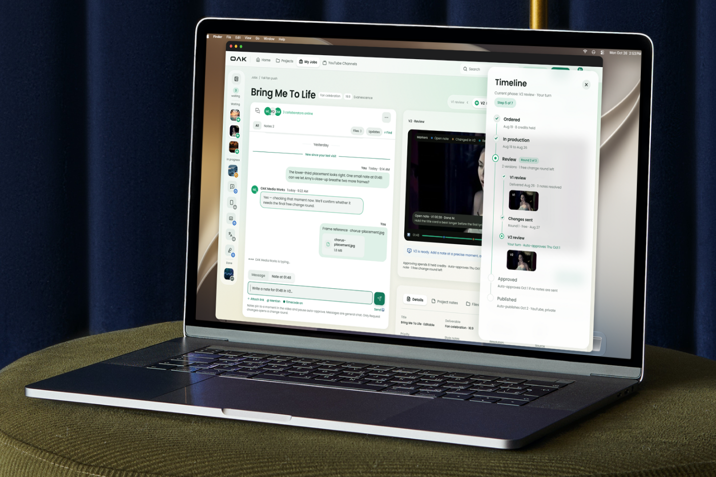
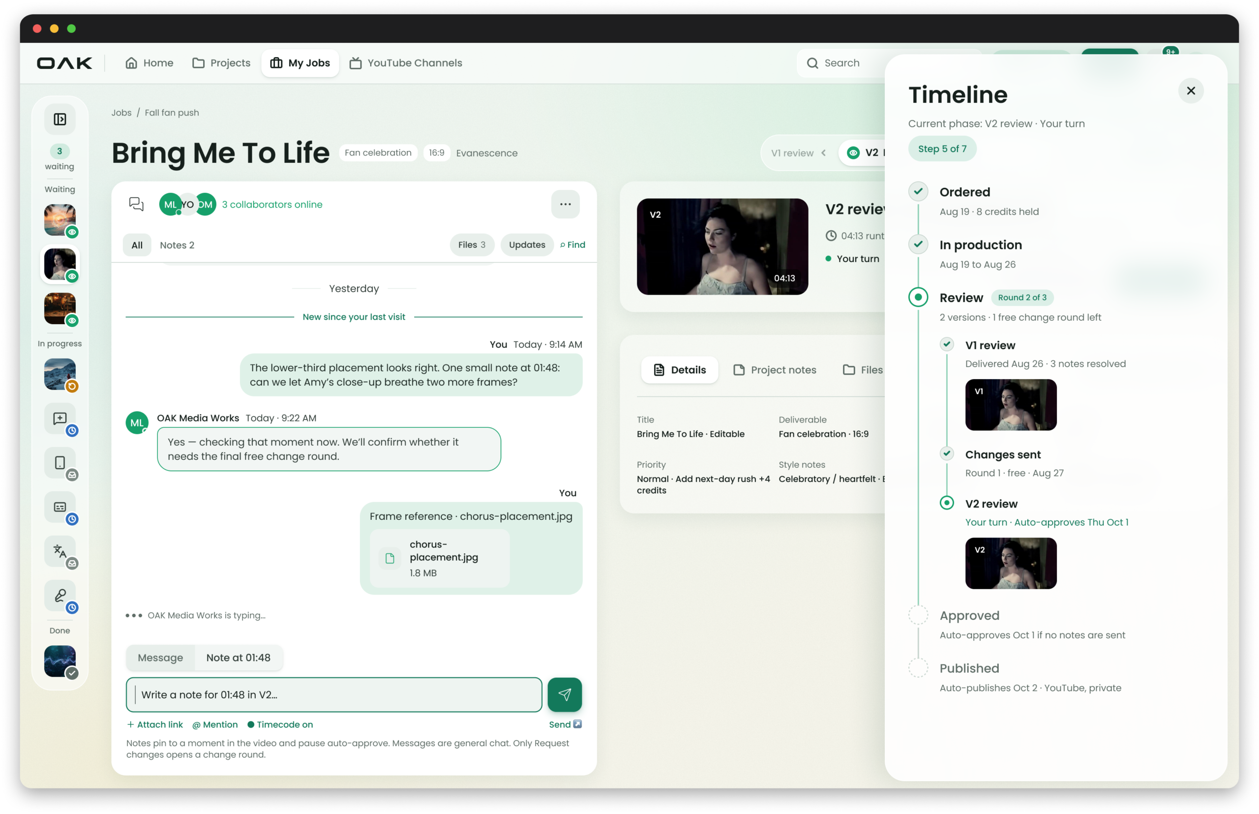
A narrow status pill shows the step before, the current step and whose turn it is, plus the round count. The full history opens as a timeline drawer, with every revision round grouped under one Review phase.
The timeline assumes one version. Changes sent and V2 review only appear once someone asks for changes.
Should a note point at the clock or at the frame?
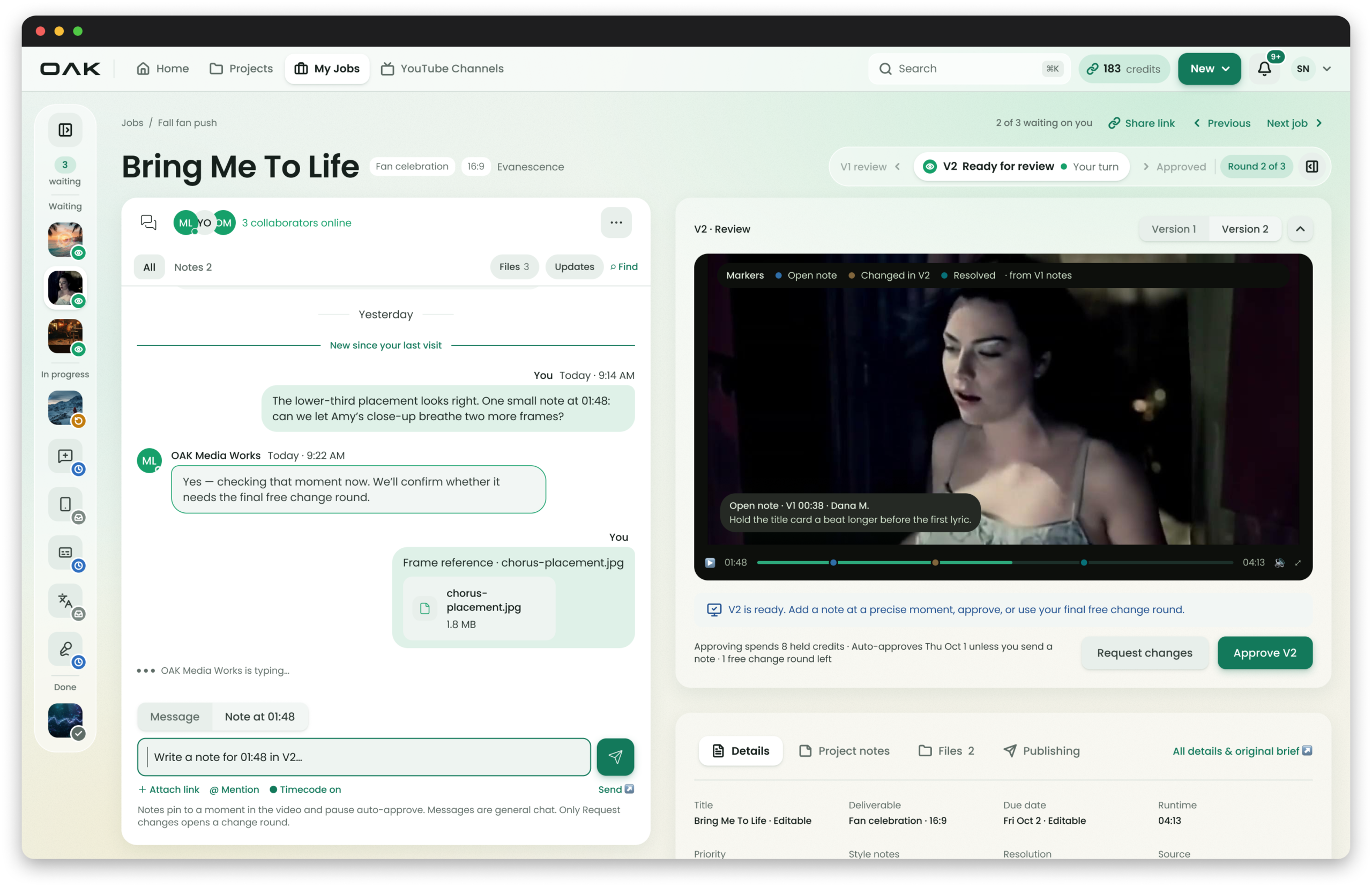
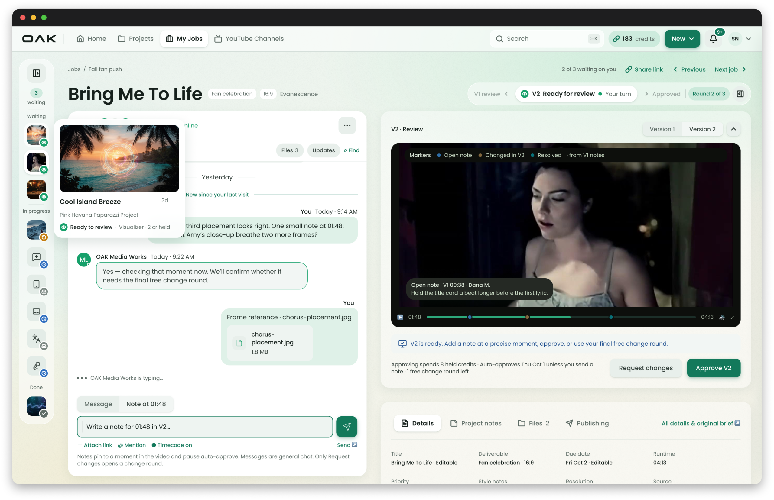
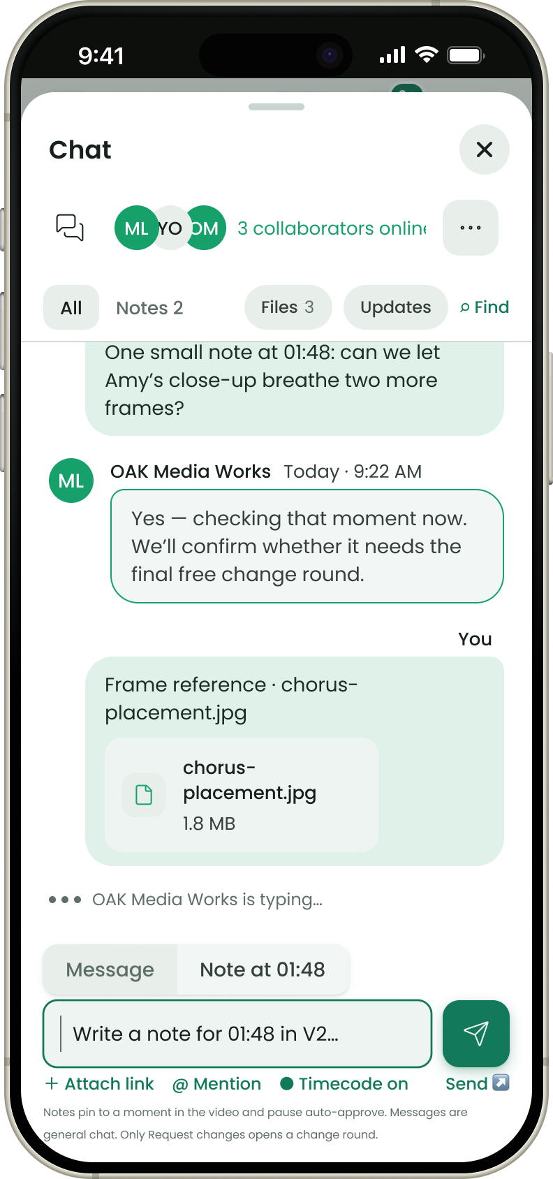
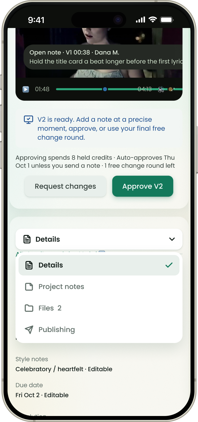
At the frame. The composer switches between Message and Note at the current timecode, notes land as markers on the scrub bar, and the markers show what is still open, what changed in V2 and what is resolved.
Notes pause auto-approve. Only Request changes opens a change round.
How does a label work through 200 jobs without losing its place?
A narrow job rail groups jobs by whose turn it is: waiting on you, in progress and done. Hovering a job shows its full card, and the header counts what is waiting, with Previous and Next job links.
The rail sorts by whose turn it is, not by date ordered.
04 · The solution
The same review workspace on a laptop and a phone.
Built and working
05 · Outcome
What changed
Pre-release QA
18 checks
3 blockers, 4 majors found
Run as client, label admin and editor before any label used the product.
Revision notes
Timecoded
was clock time
Each note pins to a frame and shows as a marker on the scrub bar.
Free change rounds
1 left
was "0 of 2 used"
The count says what you still have, not what you've spent.
Job status
Read-only
was a dropdown for clients
Labels see whose turn it is. The production pipeline stays with OAK.
Counted from the before and after screens and my QA report of September 9, 2026. Not production analytics.
The redesign is complete in Figma in light and dark at 1920, 1440, 1024 and 390 wide, and I'm building it as OAKroots components in Storybook for OAK's engineer to ship.
A findings report became one page a label can run from order to YouTube.
