

Many applications, one platform
Before
9 applications, 4 tech stacks
React
Angular
AngularJS
Plain JavaScript
Features move over app by app
After
One platform, one system
A shared React library, built by the Platform team from the specs
- Products merged onto the platform
- 8
- Spec screens
- 166
- Styling
- Design tokens
- Source of truth
- Storybook
Every spec covers the full interaction
One grid, the same rules everywhere
01 · The problem
Nine applications were becoming one platform, and nothing told them how to look or behave the same.
After the Continuum merger, ConnectWise set out to bring its products onto one platform. That would happen app by app, not all at once, so the system had to serve each application's real functional needs the moment its features moved over.
Looked alike, acted differently. The same control behaved one way in one product and another way in the next.
Four tech stacks. React, Angular, AngularJS and plain JavaScript, each with its own components and fonts.
No shared standard. Nothing told design or engineering how a component should be built.
02 · Constraints
Build for the platform, while features arrived one app at a time.
Migrate, don't replace
Apps moved onto the platform feature by feature. Each component had to cover the real requirements of whatever moved next.
Engineering was waiting
A Platform team built React components straight from my specs, and product teams couldn't start until they existed. Specs had to work without a meeting.
Accessible by default
Every grid cell carries an accessible text alternative, and keyboard order is defined for compound controls.
03 · Key decisions
Four questions shaped the system.
Adopt an open source system, or build our own?
We benchmarked the leading open source systems. Each was powerful in its own right, but the data modeling our products needed called for a ground-up system. We based it on MUI, then built from scratch to lower outside dependencies and keep the freedom to evolve.
Borrow the foundation, own the components.
200+ ready componentsFast to start, but heavy customization for our data models and a dependency we didn't control.
A ground-up systemComponents shaped around our data, fewer outside dependencies, and room to change direction.
What does a spec include?
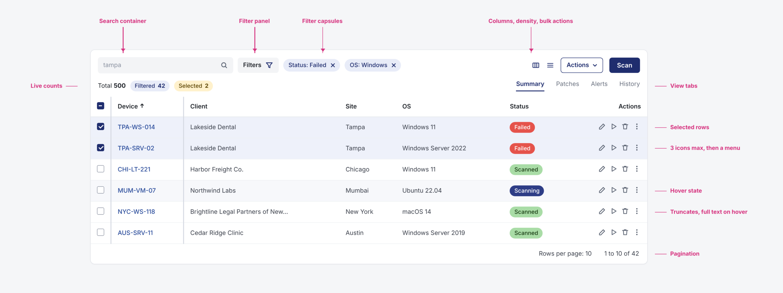
Every state, every rule, every edge case. Each component got a states matrix (default, hover, clicked, disabled) across all content variations, plus behavior for keyboard, truncation and overflow.
166 spec screens, each with an ID engineering could reference in a ticket.
How do components stay consistent as data grows?
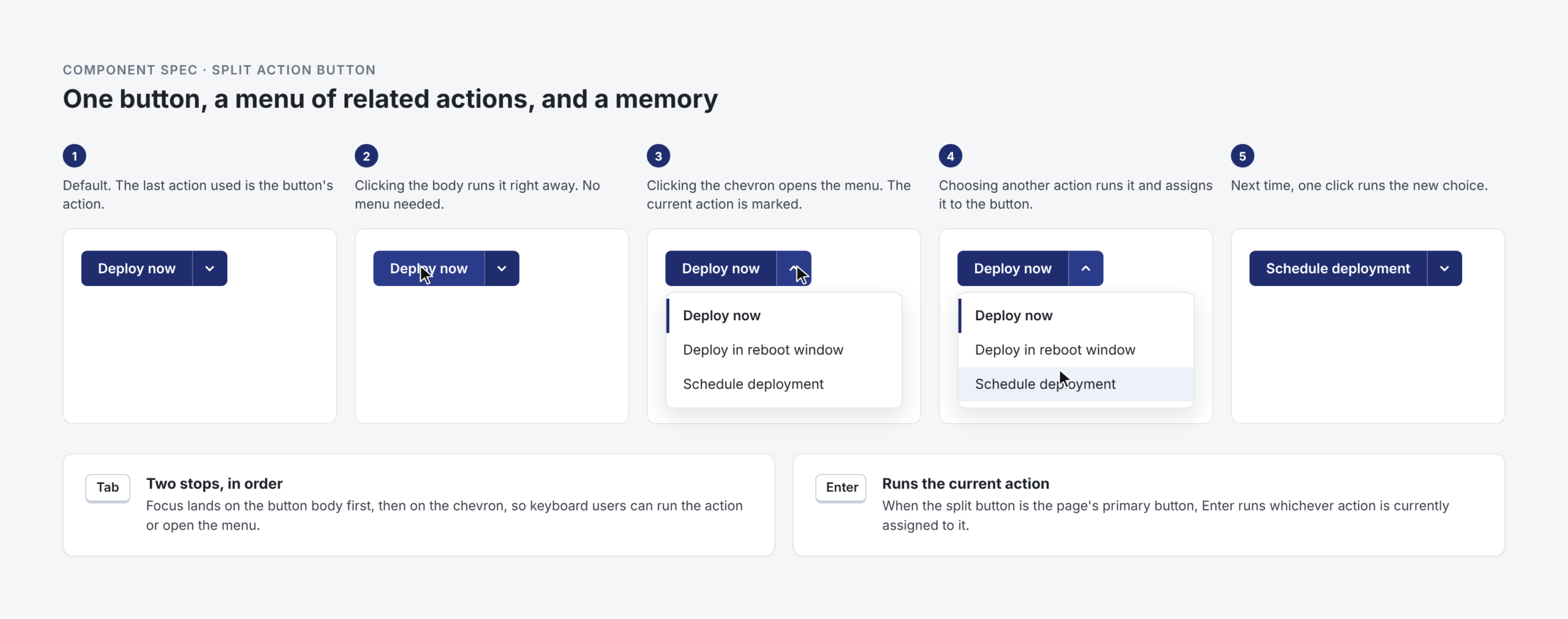
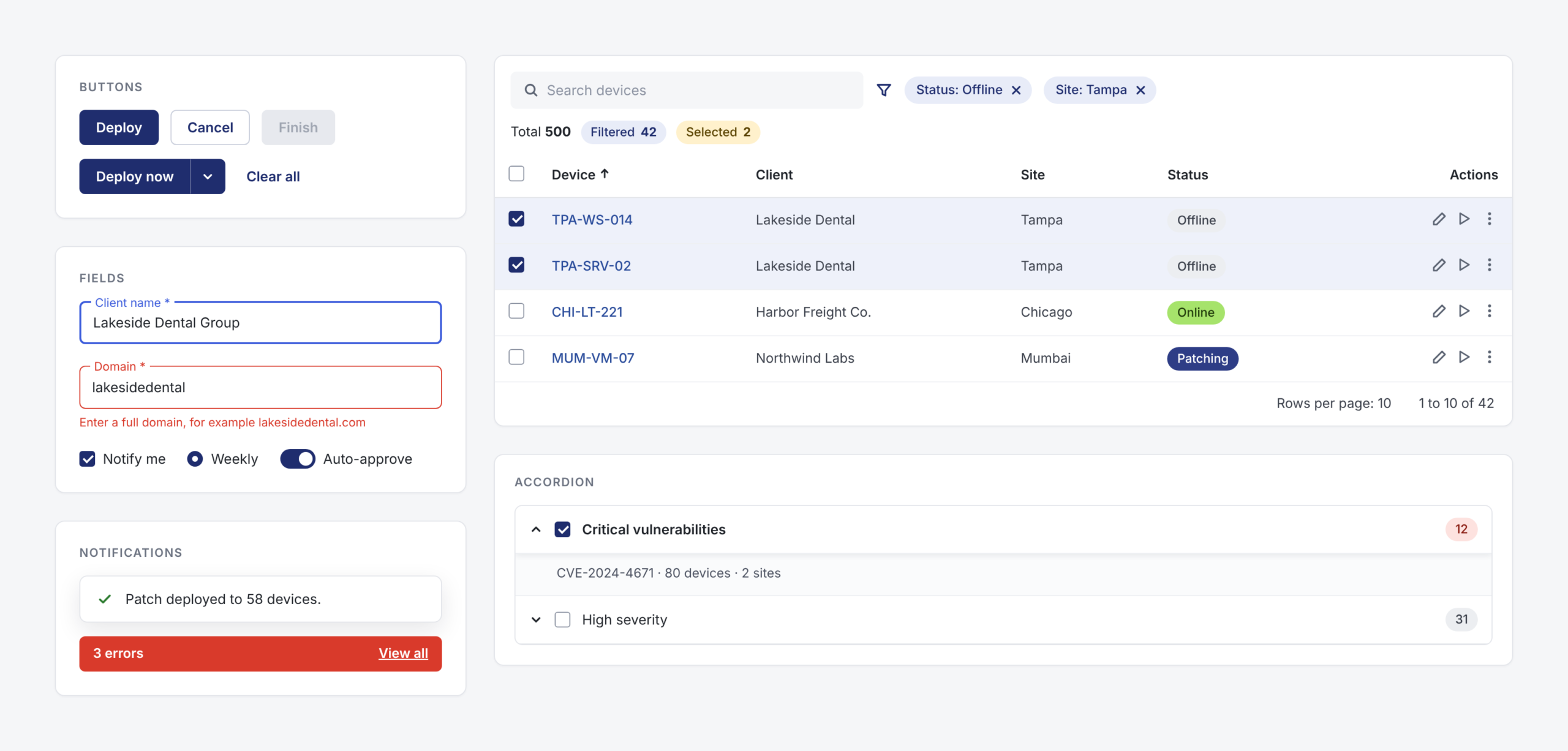
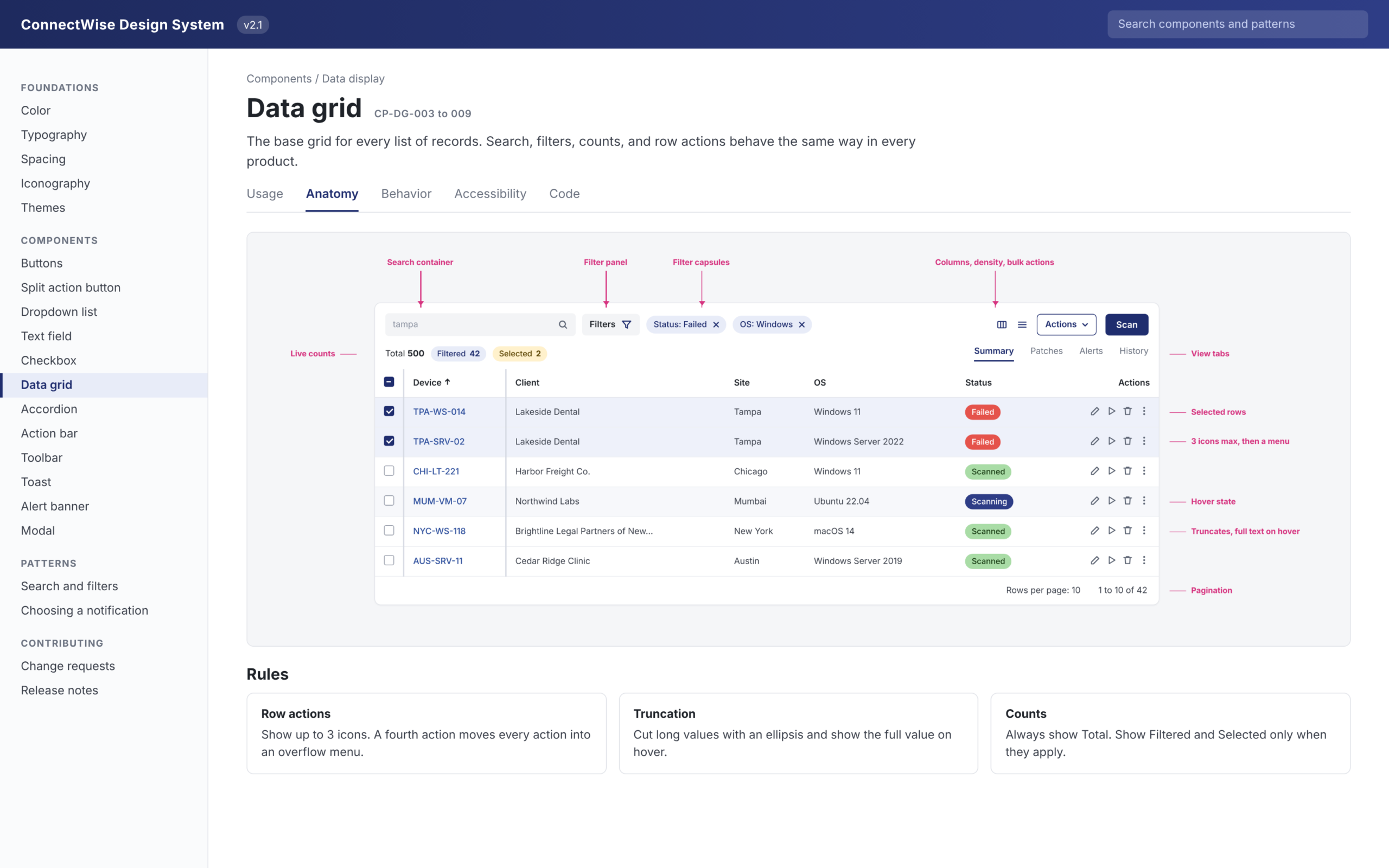
Rules that scale instead of one-off layouts. Row actions show as icons up to three, then fold into a menu. Long text truncates and shows in full on hover. Tabs overflow into a menu instead of wrapping. The action bar pins under the top navigation and never scrolls sideways.
The rule decides the layout, so the fourth team builds it the same way as the first.
How does a system stay consistent once other teams use it?
A governance plan, not just a library. It added a formal change request process, dedicated maintenance of the design library, and Storybook as the single source of truth for developers. Designers ran training for scrum teams and PMs.
Anyone could propose a change. Nothing changed without a request.
RequestAny designer or developer proposes a new component or a change.
ReviewChecked against existing patterns, so nothing gets built twice.
UpdateThe Figma library and the Storybook component change together.
Announce and trainRelease notes go out, and scrum teams and PMs learn what changed.
04 · The solution
One system, documented where teams actually look.
1Anatomy first
Every part has a name
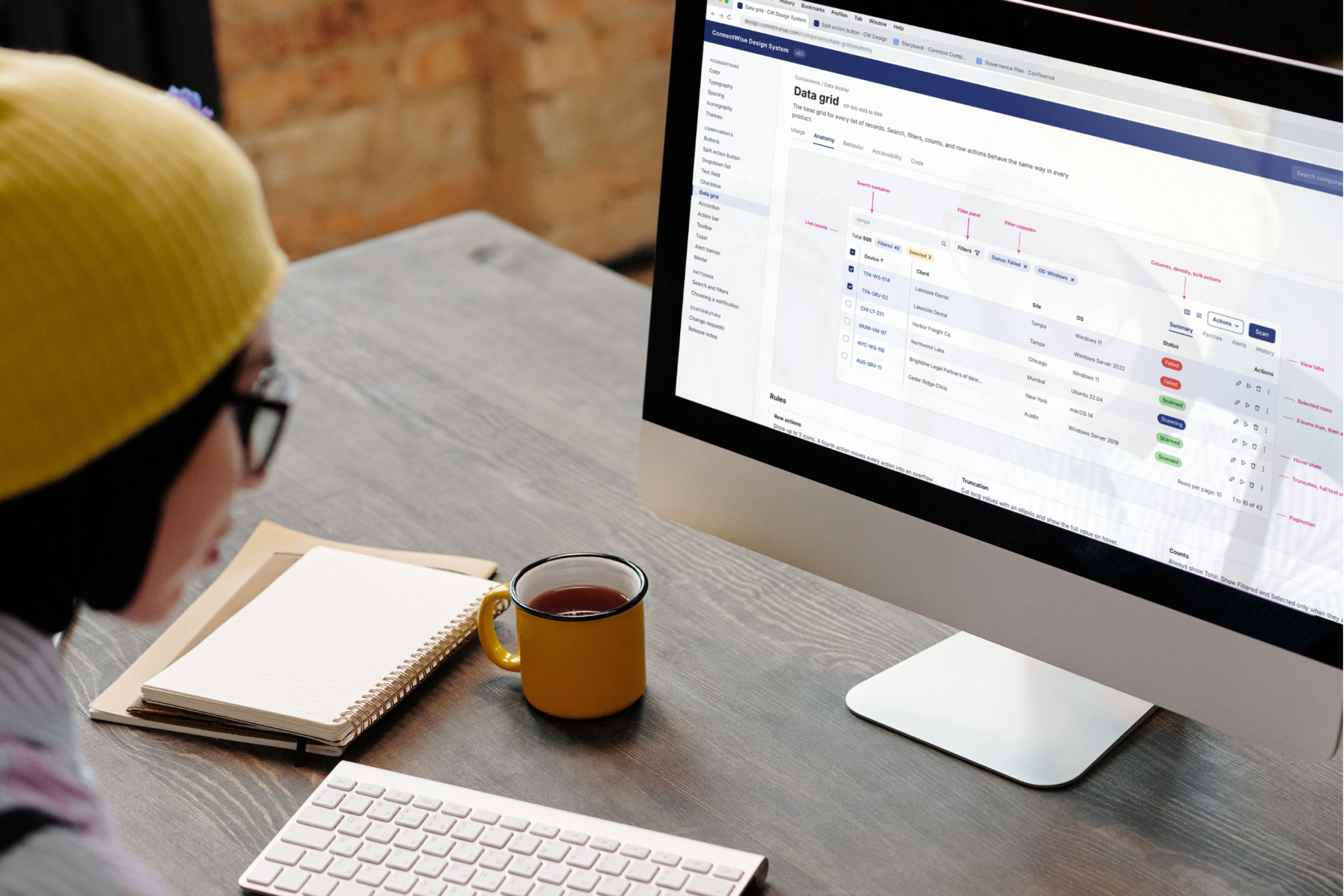
Each component page opens on its anatomy, so designers and developers use the same words for the same parts. The rules sit right under the picture.
2Behavior
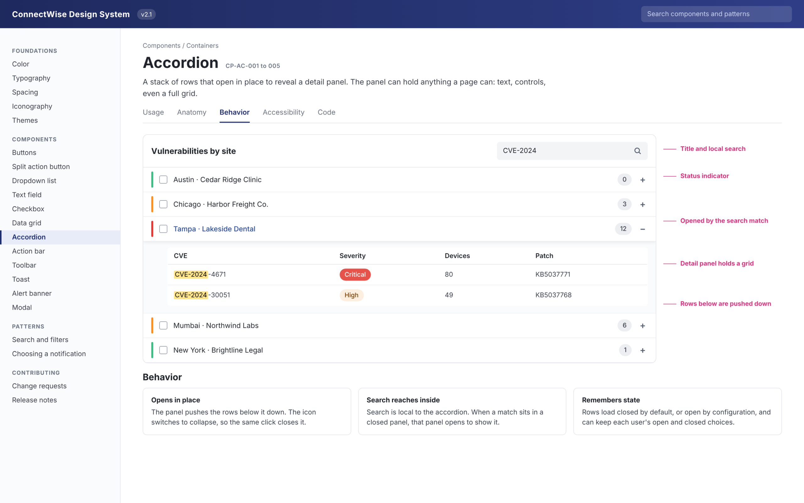
How it acts, not just how it looks
The accordion spec covers what a mockup can't show. Rows open in place and push the rest down. Search reaches inside closed panels and opens the one holding the match. Each user's open and closed choices can be remembered.
3Themes from tokens
Every style is a token, so the whole platform can change its look
Color, type, spacing and shape all came from design tokens, never hard-coded values. That made theming possible, which was both an aesthetic choice and a business one: partners could white-label the platform with their own brand. Try it.
Design tokens
color.primary#1F2D6E#0F5E63#6B2FA3color.nav#1E2A5E#0E4D52#3B1C5Ccolor.link#2A4C9B#127A80#6B2FA3color.selected#E8ECF8#E2F2F2#F1E9F8radius.control6px6px18px05 · Outcome
What changed
Products on the platform
8
merged app by app
Partners see the same controls behave the same way across products.
Tech stacks
1
down from 4
One React library, built by the Platform team from the specs.
Spec screens
166
each with a component ID
States, rules and edge cases engineering could build from directly.
Theming
Tokens
instead of hard-coded styles
Blue, Teal and partner brands, without forking a single component.
Counts from the component specification document and the design system planning deck.
One dropdown, one grid, one set of rules, eight products.
06 · What I'd do differently
Set up governance before the first component shipped, and protect the schedule.
The change request process came after teams had already started building, so early drift had to be cleaned up later. The project also ran stop and start, and a fixed weekly block for system work would have kept momentum between pauses.
