

Summary
The project
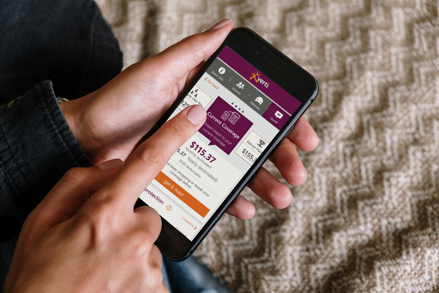
MAPFRE launched a new digital auto-insurance brand in the U.S. called Verti. I was brought in as a UX designer to help shape the mobile quote-and-buy experience for a market where speed, clarity, and trust were critical. Verti aimed to offer a fully self-service model, letting drivers purchase and manage their policies entirely online.
Core user problem
Buying car insurance requires a long list of inputs, multiple verification steps, and several backend calls to confirm a driver’s identity and risk profile. The early concept needed a clearer, more approachable flow that reduced friction and felt manageable on a phone.

My role, scope, and collaborators
I designed the quote and buy flow, including responsive layout decisions, interaction patterns, and the visual structure of the questionnaire. Because the product was still in its early launch phase, this work relied on stakeholder expertise, existing research from other MAPFRE brands, and close collaboration with engineering. I also designed the UI style guide.
Constraints and challenges that shaped the work
Qualitative insights
I gathered input from internal stakeholders and subject-matter experts with direct knowledge of insurance customers and regulatory expectations. These conversations consistently emphasized the need to reduce perceived effort, avoid dense reading, and maintain user momentum through the flow.
Quantitative Data
I reviewed existing research and behavioral data from related MAPFRE insurance products to understand where users typically struggled in long-form insurance flows, particularly during data-heavy steps and verification moments.
Design Approach
Keeping the experience approachable
Visual breaks, simple iconography, and restrained use of color were used to segment the flow into clear, digestible sections. This helped users stay oriented and reduced the intimidation factor common in insurance applications.

Reducing cognitive load
I designed the experience as a long, lightweight scroll that allowed users to answer one question at a time rather than confronting dense, multi-field forms. This structure made the process feel more like a guided questionnaire than paperwork.
Structuring pace and progress
The flow was organized around logical categories that also aligned with backend requirements. Where system calls were necessary, they were paired with natural screen transitions, helping delays feel intentional and preserving a sense of forward progress.


Responsive content
The experience was designed around a mobile first flow, but the native app experience would begin after the user had made a purchase. the initial quote flow was designed to exist as both a desktop website, and a mobile site that could also frame the quote process into the account management app for a seamless quote-to-buy experience.
Mobile UI Style Guide (Sample Sheet)
To support consistency across the native mobile experience, I produced a focused UI style guide delivered as a mobile-format sample sheet. It documented core typography, color usage, spacing, and component patterns used throughout the quote and buy flow. The guide was designed to be lightweight and implementation-ready, giving engineering and product teams a shared reference without slowing development.
Outcome
This work contributed to Verti’s initial U.S. product launch and established a clear, mobile-friendly quote and buy experience for a cost-conscious audience. While I did not have access to post-launch metrics, the project strengthened my ability to design high-stakes transactional flows within regulated environments.
The experience reinforced the importance of pacing, content restraint, and perceived effort in mobile conversion flows, lessons that have continued to inform my approach to complex, data-driven products.