The project
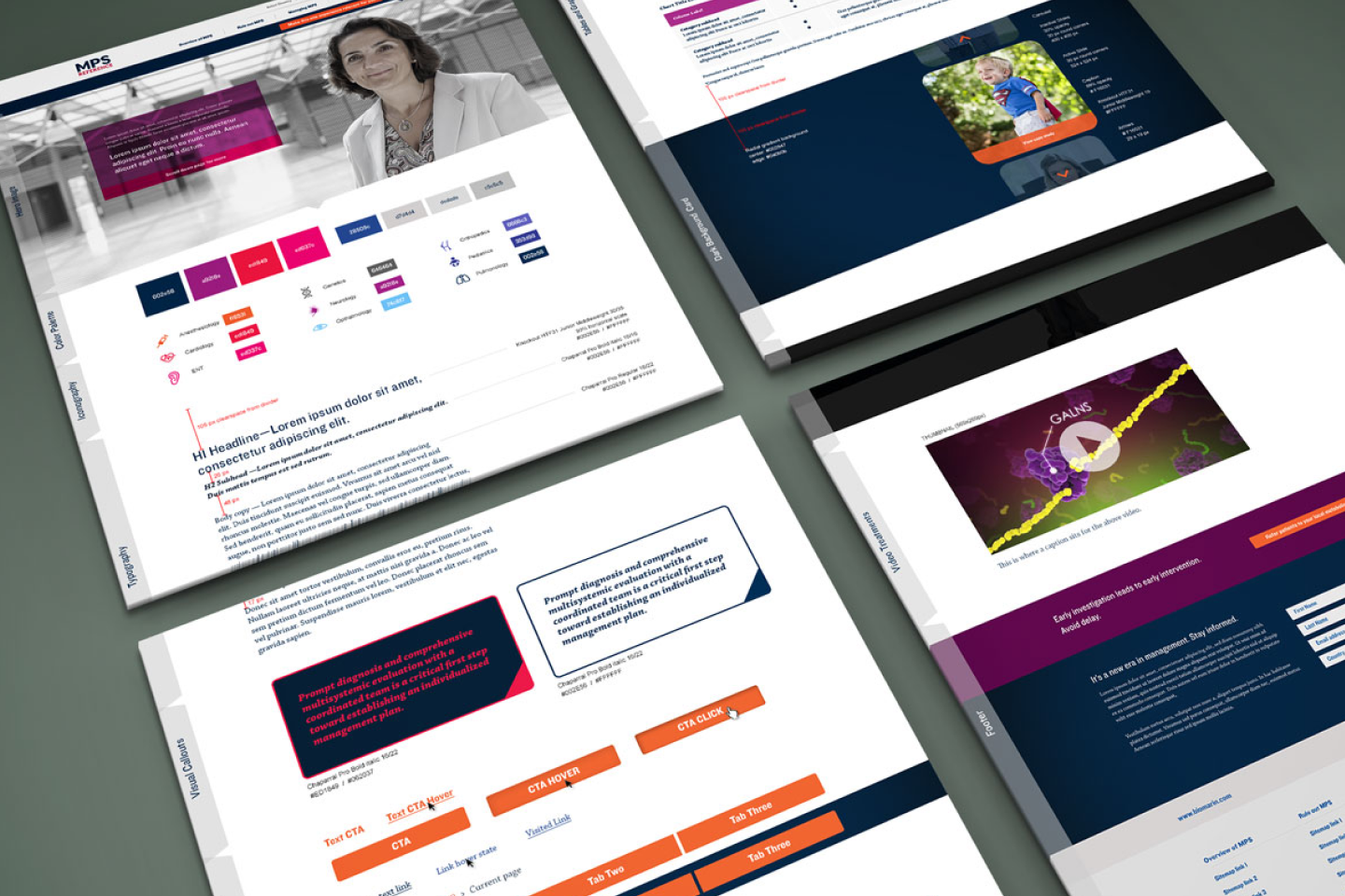
The MPS Reference website was created to support clinicians, researchers, and caregivers working with rare mucopolysaccharidosis (MPS) diagnoses. The platform aggregates complex clinical and longitudinal data and presents it in a way that allows users to quickly understand disease progression, comparisons, and key indicators without requiring deep statistical interpretation.
I was brought onto the project to define standards for data visualization and interface design, and to adapt the experience for mobile layouts without compromising clarity or accuracy. The work focused on making dense, high-stakes medical data readable, comparable, and accessible across devices.
Core user problem
Users needed a clear, reliable way to interpret rare disease data, but existing reference materials were fragmented, text-heavy, and difficult to scan. Important trends and comparisons were often buried in tables or narrative descriptions, increasing cognitive load and making it harder to extract insight quickly.
Because this data is often consulted in clinical or research contexts, misinterpretation or delay carried real consequences. The challenge was to design an interface that supported fast comprehension without oversimplifying medically significant information.

Constraints and challenges that shaped the work
My role, scope, and collaborators
I led visual and UX design for the site, defining:
- Information hierarchy and layout patterns
- Data visualization standards for charts and comparisons
- Responsive behaviors across breakpoints
- Visual language for clarity, contrast, and consistency
I worked closely with subject matter experts to ensure visual representations aligned with clinical meaning, and collaborated with development to ensure designs were feasible and scalable as new data sets were added.
Design Approach
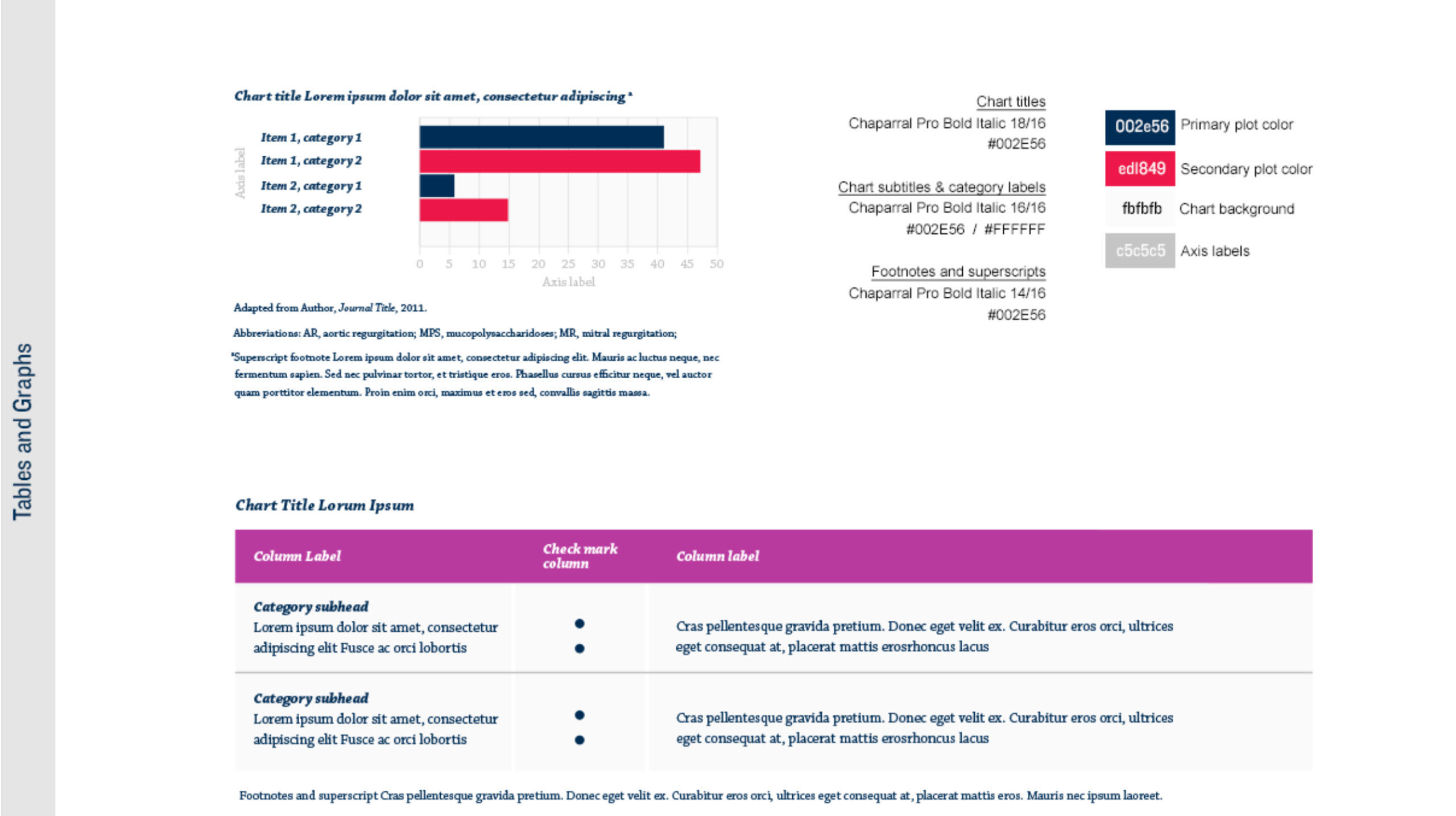
Establishing Visualization Standards
I defined consistent rules for:
- Axis labeling and scale usage
- Color semantics to support comparison
- Annotation and callouts for key thresholds
These standards ensured that once users learned how to read one visualization, they could understand others without additional explanation.
Designing for Comprehension, Not Decoration
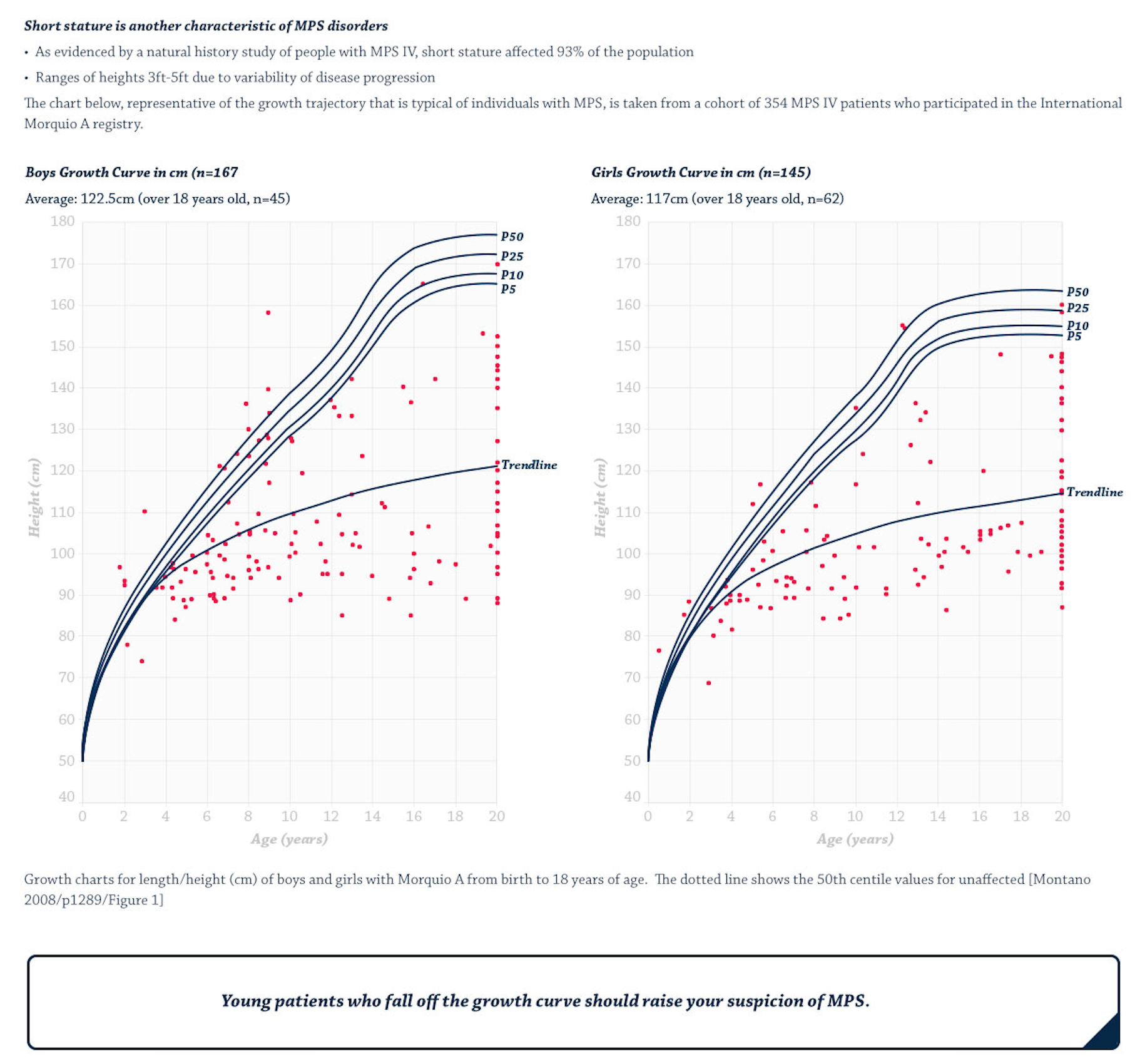
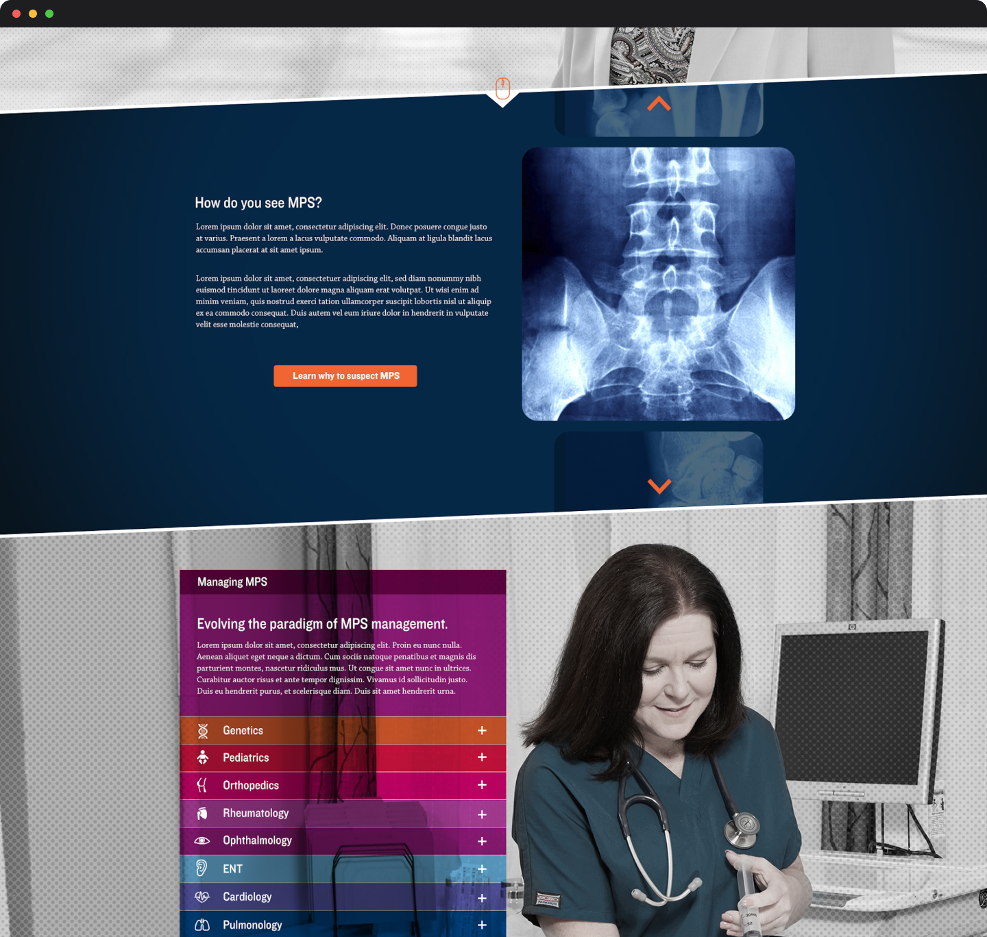
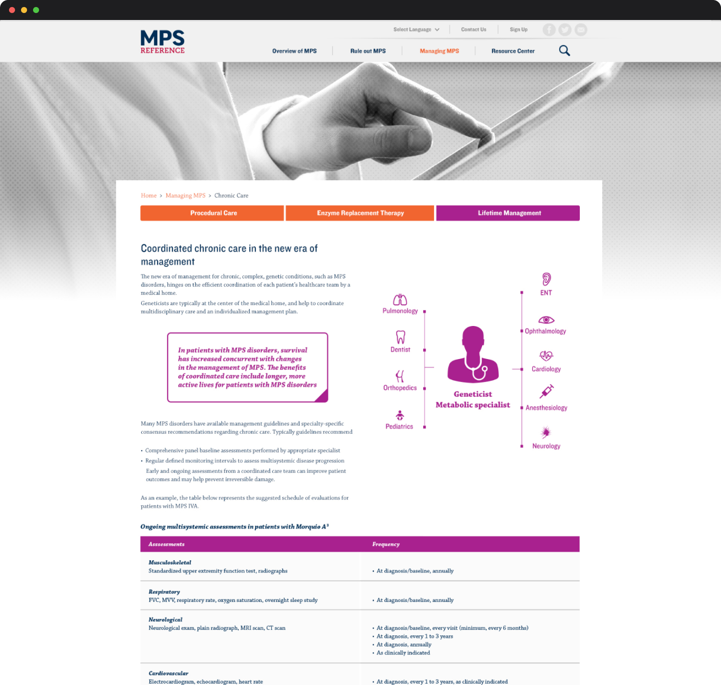
The core design decision was to treat data visualization as the interface, not as an enhancement. Charts, comparisons, and visual groupings were designed to communicate meaning at a glance, with text used to support interpretation rather than lead it.
Progressive Symptom Exploration
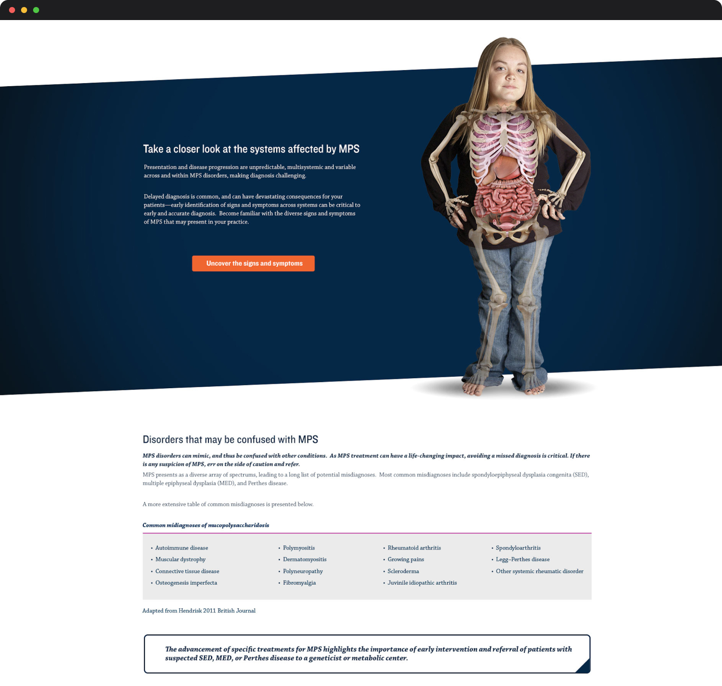
Symptom exploration was designed around a visual, progressive disclosure model rather than exhaustive lists or tables. Users select regions directly on a patient illustration to narrow the interface to relevant symptom groups, then drill into examples only as needed.
This approach supports both expert and non-expert users by allowing pattern recognition to precede terminology. Clinicians can quickly focus on suspected areas, while caregivers can explore symptoms without needing precise medical language.
By anchoring interaction to a familiar human form, the design reduces cognitive load and keeps users oriented as they move from overview to detail.
Outcome/Reflection
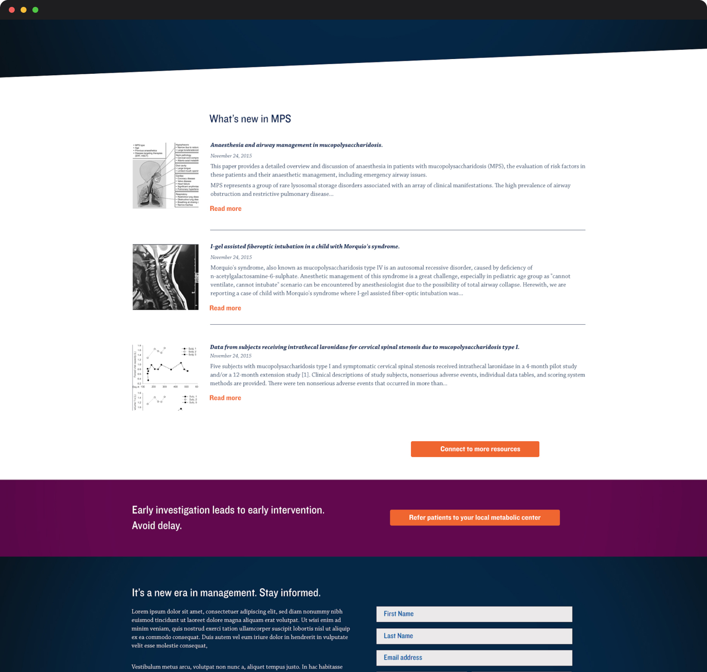
The final design delivered a clear, structured reference experience that made rare disease data easier to interpret across devices. The system established a reusable visual foundation that could scale as additional diagnoses and datasets were introduced.
This project reinforced an approach I continue to apply in more complex systems work:
designing for decision-making under uncertainty, prioritizing clarity over completeness, and treating data presentation as a core UX problem rather than a visual afterthought.